
UNIQLO: Usability Heuristics of Aesthetic and Minimalist Design (Concept Project)
The Brief
Jakob Nielson’s eighth usability heuristics for interfaces is to use an aesthetic and minimalist design. This ensures that we keep the visual design content focused on the essentials. The primary goal is to redesign one of Japan’s largest fashion retailers’ websites, UNIQLO, so that the main features of an e-commerce website are prioritised.
The Solution
After analysing the current website, it appeared that there was a lot of irrelevant information that disrupted the hierarchy of the main features. In this concept project due to time constraints, I redesigned two core pages essential to the purchasing process, the product page and the product description page. I focused on creating simple, clean and straightforward designs that adhered to UNIQLO’s branding.
Team:
Solo team
Tools:
Pen & Paper
Figma
Duration:
3 day design sprint
Deliverables:
Clickable prototype
Methods:
Business Analytics
Competitive Analysis
Sketching
Wireframing
Prototyping
Branding
Nobuo Domae, the CEO of UNIQLO USA states that UNIQLO embraces both shun and kino-bi. Shun [旬] means 'timing, best timing, but also at the same time it's trendy,' and kino-bi [機能美] means function and beauty, joined together. These qualities reflect the defining characteristics of modern Japanese culture, modern ‘Japaneseness'.
Upon research, UNIQLO has a reputation for its high-quality and affordable clothing. This innovative brand has taken the approach of not following fast fashion trends. Their clothes are simple, essential yet universal, enabling the wearers to blend them with their individualistic style.

Signal-to-noise ratio
The signal-to-noise ratio represents the ratio of relevant to irrelevant information. In a user interface, the information involved in this ratio could be anything from text content, visuals, audio etc. Anything users have to process, can be considered signal or noise. To improve the efficiency of communicating information to help users complete their tasks, for this design, I am aiming for a high signal-to-noise ratio.


Navigation
The current navigation is not as accessible on smaller screens. With a 14-inch laptop, the extended mega menu is not fully visible and the website can also glitch where I am unable to scroll down to see the rest of the menu categories. There are also a lot of categories that can be very overwhelming for the user and makes it look cluttered. The categories can be further divided into smaller sections making it easy for the user to find what they want.
Product Page
The filter menu appears to take up around a third of the webpage. This side menu doubles up as a smaller mega menu. For example, under outerwear, there are jackets that just navigates you to the jackets page and is completely irrelevant to innerwear and thermal. The actual filters are hidden at the bottom of the menu and is very hard to scroll to.
Despite being the main feature of this page, the four columns of product images are small and hard to see, making the website feel claustrophobic and cluttered. In addition to this, the images are not consistent as some of the images only show the product with no model wearing the garment. Some images also only show a white garment against a white background. This can cause confusion as users cannot see the fit of the garment and must click on the product description page to find out more, adding another step to their shopping experience.
UNIQLO promotes their HEATTECH line in their banner however feature their AIRISM line first which can be confusing.

Current Website Analysis
Competitor Analysis
There are many large labels out there that have similar traits to UNIQLO. For example, H&M and the ICONIC follow fast fashion, offer the latest trends and have an extensive range of clothing, whilst ARITZIA and OGL mainly sell the basics focusing on sustainability, luxury and sourcing high-quality materials. MUJI focuses on no-brand quality goods with minimalist packaging and has the value of “simplicity and emptiness yield the ultimate universality”. All these websites have similar elements of hierarchy when it came to product pages and have influenced the mock-up I have designed.

What is successful ecommerce?
Through research, there are a few features that make or break an ecommerce site. This includes a quick and easy checkout process. clear and reasonable return policies, good customer service and multiple payment options etc. Unfortunately, without consultation with the business, I am unable to control these changes.
However, product pages are one of the most important parts of an online store because of their influence on customers. A well-constructed product page could convince a customer to complete a purchase and a bad one is likely to drive them away.
Easy navigation also plays a large role in ecommerce. Unlike being in a real store, customers are unable to see all the products in front of them. If they are unable to navigate the website and find certain items, it can be very detrimental to their shopping experience.

Product Description Page
There is an unnecessary amount of white space located under the excess photos, between the images and the headings and in the reviews section. The image and product heading (size, colours, purchasing options) both take up around 50% of the space which makes both features compete with each other and diminishes the relative visibility. The images are small and do not allow you to zoom in closer to the fabric which can be frustrating as users are already unable to touch the fabric.
The description section is chunky and looks outdated which does not align to UNIQLO branding. The dropbox option also encourages scrolling.
With their HEATTECH line being one of UNIQLOs best selling winter essentials, this product description page offers no information as to what HEATTECH actually is.

Updated Website
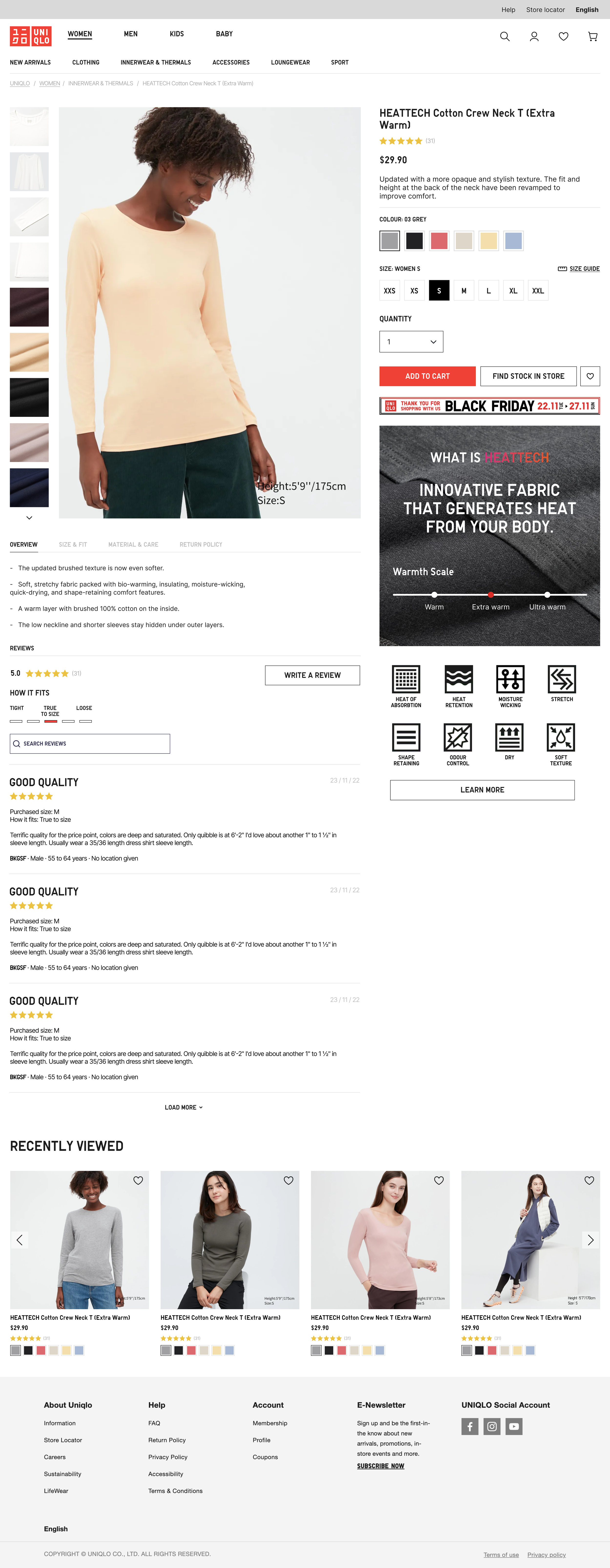

Navigation
When hovering over one of the mega menu options, another line of menu options appears underneath. This lessens the bulk of the menu from before and helps users find exactly what they need easily. For example, since UNIQLO thermals are their best-selling products it’ll be easier to have a section of their own.
Banner
To help users understand more about what they are browsing, I’ve added both of the famous innerwear materials as a separate link with a call to action. Seeing this first on the page will allow for the opportunity to educate the users on what they are purchasing,
Filter
I have omitted the side menu completely and opted for a side-by-side dropbox design for the filters at the top of the page. This filter is clearer and in a more visible spot than the current one. This has also given me more room to focus on enlarging the product images for easy browsing.
Product Card
I used all the space in this section for product images. I redesigned the spacing of the heading, price, rating and colours so that there is less white space in this area and users do not have to scroll excessively. This helps create a more simplistic design that aligns with UNIQLOs branding. The visuals support the goals of the users and business by prioritising the display of garments.
Load more
The main advantage of the Load More button is that it adds results rather than replaces them. The user has the opportunity to return to one of the previous products instantly, simply scrolling the page up, and not wondering where the needed item remains. This adheres to the usability heuristic of error prevention.
UNIQLO’s current design has a load more button however I have added a feature that informs users of how many products are showing out of the results. This allows for visibility of system status where we are openly communicating between the system and the user.
Recently viewed
UNIQLO’s current design has this feature which helps personalise the shopping experience.
Footer
The footer remains the same as the current UNIQLO footer.
Product Image
When it comes to our online shopping experience high-quality images are essential to selling your product.
Product images capture attention as they’re the first thing your shoppers see. Shoppers want to ensure that the product they are considering matches their expectations, whether it’s colours, sizes, styles, or other qualities that help them develop an opinion of the product.
Modern online shopping experiences are all about convenience. Images also help customers better understand your products. Unfortunately, customers are unable to physically handle a product they’re interested in. High-quality product image from multiple angles helps fill this gap by providing customers with the information they need.
In this design, I have lengthened the excess images to stack so that there is more space for the display image and changed the hierarchy of the image to around 60/40.
Product Heading and Options
The design remains very similar to the current website, however, due to the shrinking of margins, there is more space for the heading and options. There are a few changes to the layout of the buttons in this section and added a more noticeable wish list button.
HEATTECH Information
After the banner on the product page to learn more about HEATTECH, I wondered why there was no information about it afterwards. Taking inspiration from OGL, I created a simple yet effective way of showing how HEATTECH technology works and the benefits of this material. These visuals easily communicate and educate the effectiveness of HEATTECH.
Reviews
The overall review layout has changed so that the information is more succinct. The current website shows 5 lines of stars from 1-5 and how many people rated each rating. However, this extra unit of information competes with the relevant information. To counter this and still give the users indication of the rating, I used an average system instead. I also added a search reviews bar so that people can hone in on specific reviews they are looking for eg. sizing, quality etc.
Descriptions and Overview
To decrease the amount of scrolling I used tabs for the descriptions. This creates a cleaner design as it uses fewer dividers to break up the information.